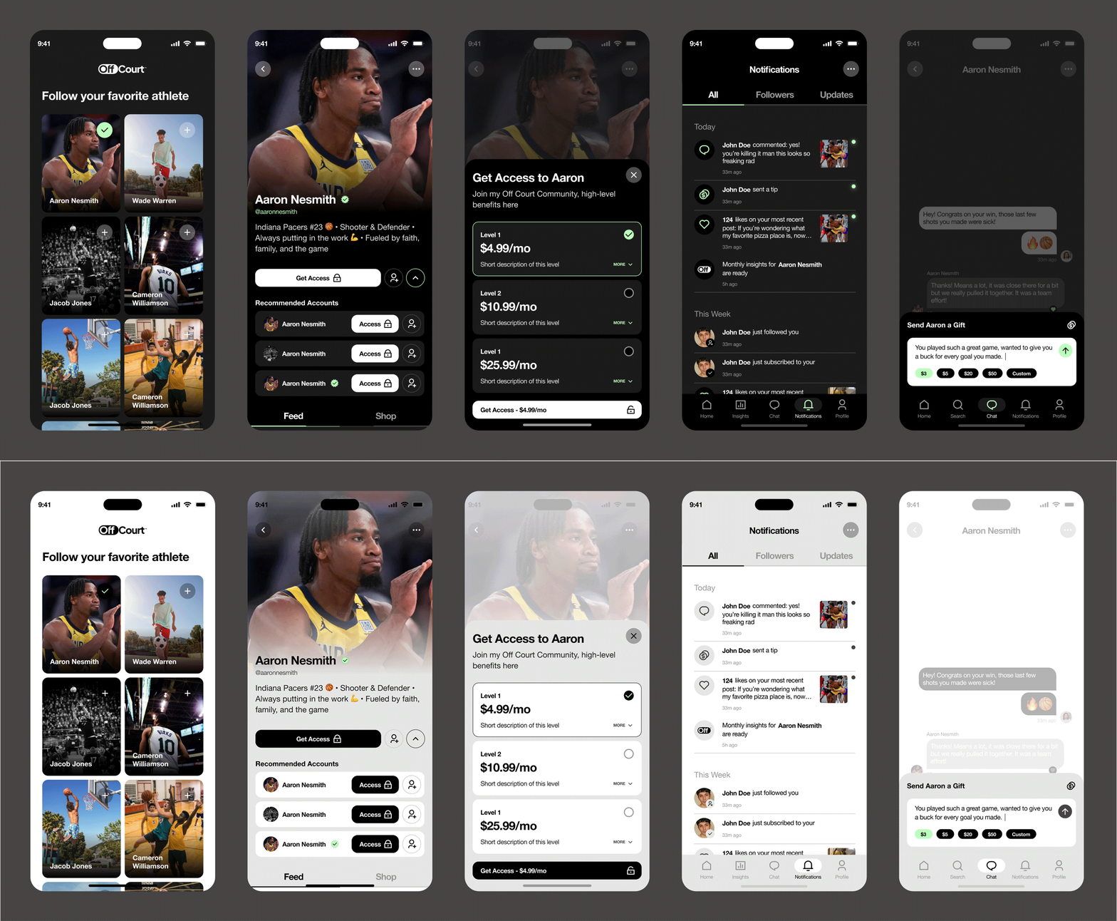
Timeless and Modern
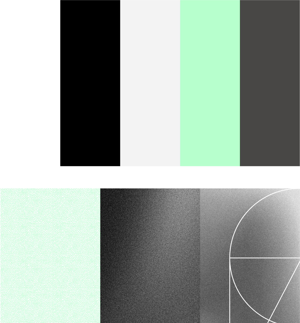
Leaning into Swiss modernism, crafting a clean, high-contrast aesthetic anchored in Helvetica Neue, a timeless and adaptable typeface. The color palette was intentionally restrained—primarily black and white, ensuring it wouldn’t compete with individual athlete brands but instead provide a sleek, consistent foundation. Subtle injections of color were introduced only when they could enhance the experience, creating moments of emphasis and energy rather than distraction.
User Acquisition
OffCourt had to position themselves for multiple users: attract more athletes, increase app interaction, and acquire new users. This was accomplished through an app landing page, athlete acquisition landing pages, and app updates to visuals, onboarding, and features.
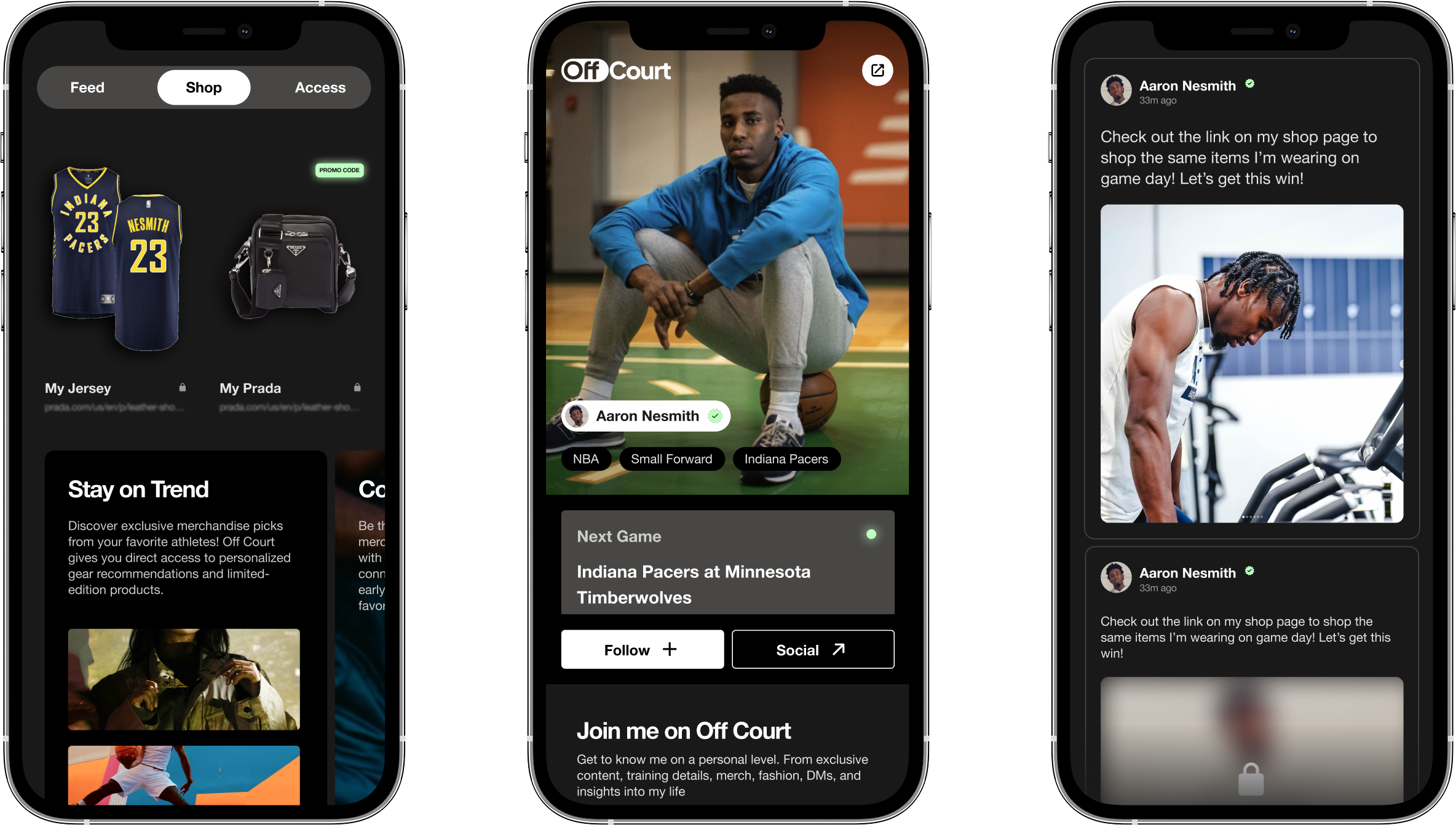
For athletes, OffCourt provides a streamlined insights dashboard, offering a snapshot of their financial performance and engagement success over the past month. For fans, OffCourt enhances connection and interaction, elevating their ability to engage directly with their favorite athletes. Designed with user experience in mind, the platform offers both light and dark mode options, ensuring a seamless and personalized experience for every user.


